Chamber of Commerce
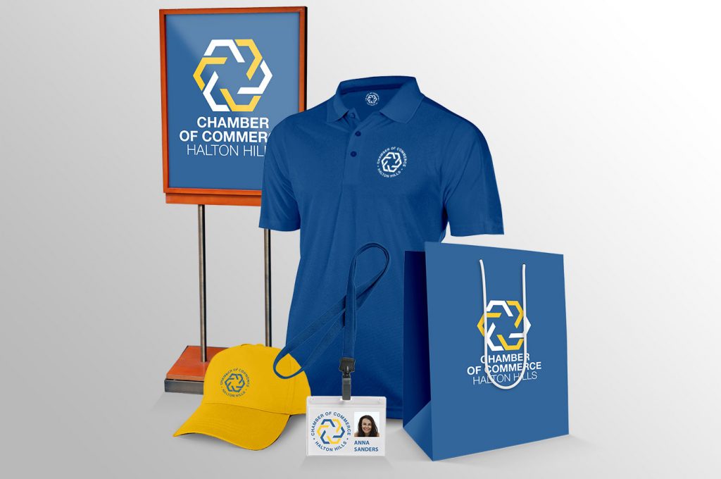
Change a company logo is never an easy decision. But, change is often necessary, and for the better. We believe that was the case of the Halton Hills Chamber of Commerce. It became obvious that the old logo simply does not work. It was difficult to use on social media that require square version, and many members commented that they are not sure they understand what the symbol represents.
As long-standing members of the Chamber, we were thrilled to be trusted with task to design new logo and visual identity for the Chamber. The new logo had to display properly on the website, social media and support the mandate of the Chamber:
“The Halton Hills Chamber of Commerce strives to be the premier association and resource for promoting the economic development and prosperity of Halton Hills and its business community.”
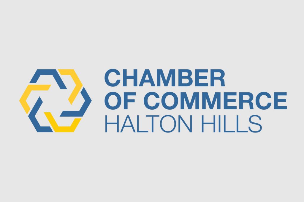
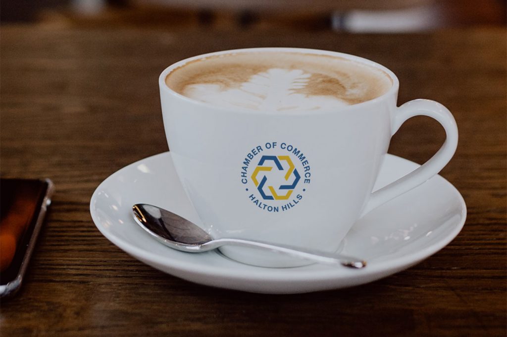
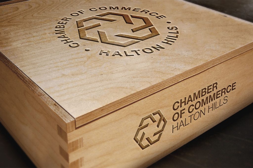
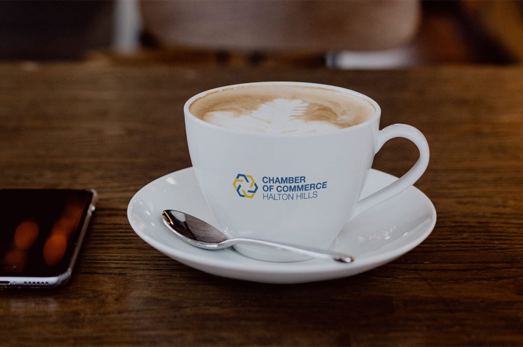
The first thing we suggested was to change the sequence of the title. Previously, the most prominent part of the logo was “Halton Hills” followed by “Chamber of Commerce”. We suggested to switch this so that logo clearly states what the organization is – Chamber of Commerce, followed by the secondary information that tells you for what town – Halton Hills.
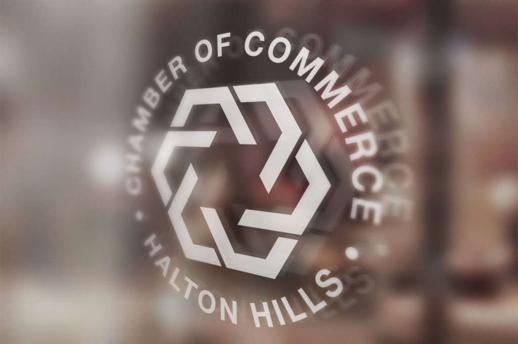
The symbol we created is full of energy yet it represents stability and unity. It is complete and welcoming and evokes sense of belonging, prosperity, and security – the reasons businesses join the chamber. The six elements represent the six pillars of the mandate of the Chamber of Commerce:
- Promote Economic Development
- Facilitate Networking
- Connecting Businesses
- Advocacy
- Education
- Chamber Programs
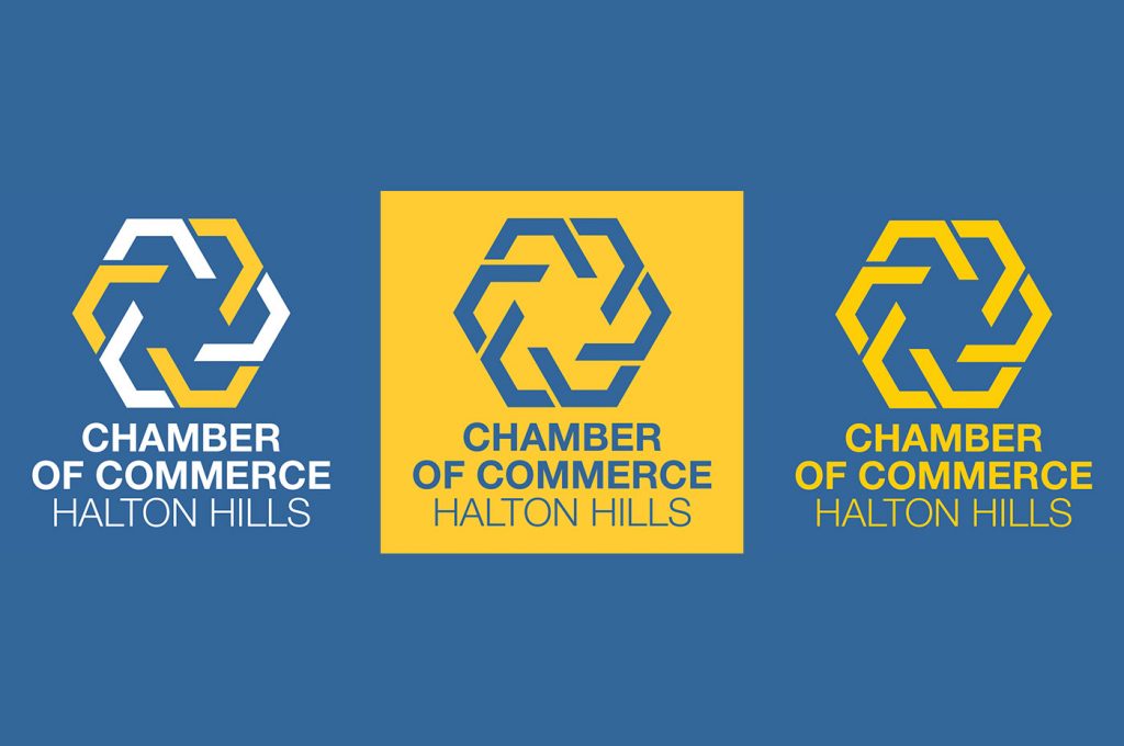
Colors we carefully chosen and have a deeper meaning. Blue is the color of business and represents trust, peace, loyalty, and competence. Deep yellow supports the chamber as a community organization and represents confidence, success, bravery, cheer, creativity, and warmth.
The font type used for the title is Helvetica. Helvetica is a modern, strong, simple and elegant font and creates balance with the complexity of the dynamic of the symbol. It has a functional role as it informs of what the organization is – Chamber of Commerce, and for which town – Halton Hills.
The logo represents the Chamber as a welcoming organization that businesses want to be part of that helps businesses and the community grow.
“Our old logo needed a new modern look and Genuweb did a great job delivering exactly what we needed. The new Chamber logo is simple and sophisticated and we are so happy with it.
Andrea really cared to understand the Chamber, and spent the time educating us about what is important when redesigning a logo all the while taking our requirements into consideration.
Genuweb cares about their clients and their image and it shows in the quality of their work.”
Melanie Frazer
Executive Director, Halton Hills Chamber of Commerce