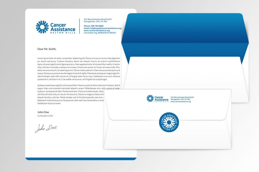
Cancer Assistance Halton Hills
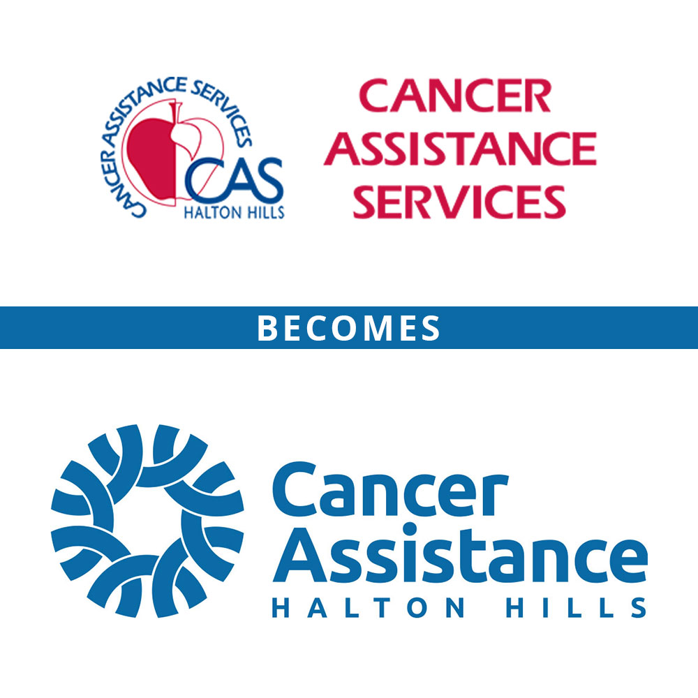
Cancer Assistance Services of Halton Hills has been providing practical services for cancer patients in the community for over 20 years! It came time to revisit their logo and branding to better represent the organization.
COMMUNITY. Community is the keyword in everything that Cancer Assistance Halton Hills does and how it operates. Our goal was to create a logo that would represent community, collaboration, safety, competency, and trust.
In designing the logo, we worked with two main shapes: a circle and a rectangle.
A circle is a soft, welcoming shape that evokes positive emotions. It represents community, unity, a sense of belonging, and security. It is a complete shape and symbolizes stability and collaboration.
The logo symbol we created consists of eight interlocking links that form a complete circle. The links represent the volunteers and staff working arm in arm to create a secure space around the vulnerable. The overlapping links subtly resemble the cancer ribbons, a symbol recognized worldwide. The links also represent the various services offered by Cancer Assistance Halton Hills.
For the logo font, we chose Ubuntu Bold. The weight of the font matches the thickness of the links in the logo symbol and adds strength to the logo.
Positioned to the left of the symbol, the complete logo is a rectangle. The rectangle adds stability and grounds the logo.
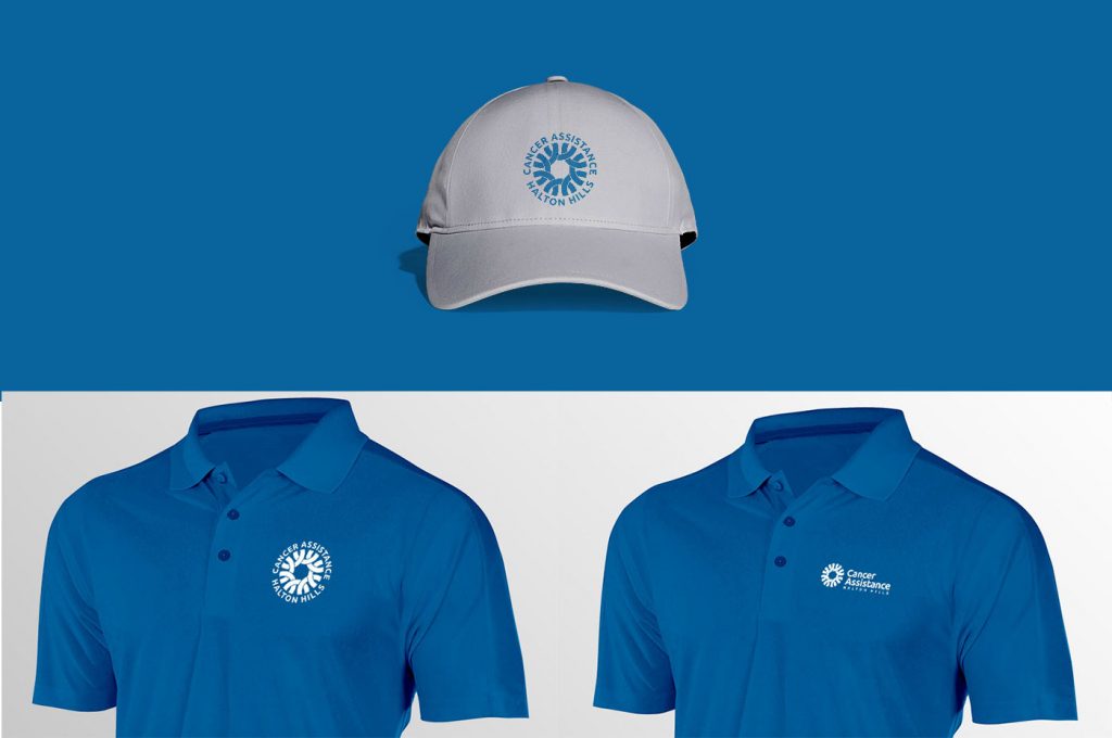
We chose blue as the only colour for the logo, which should be used mainly on a white background. Blue is used to evoke trust, security, competence, seriousness, and loyalty. White is the colour of innocence, purity, and peace.
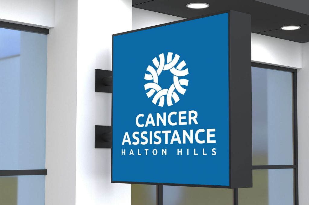
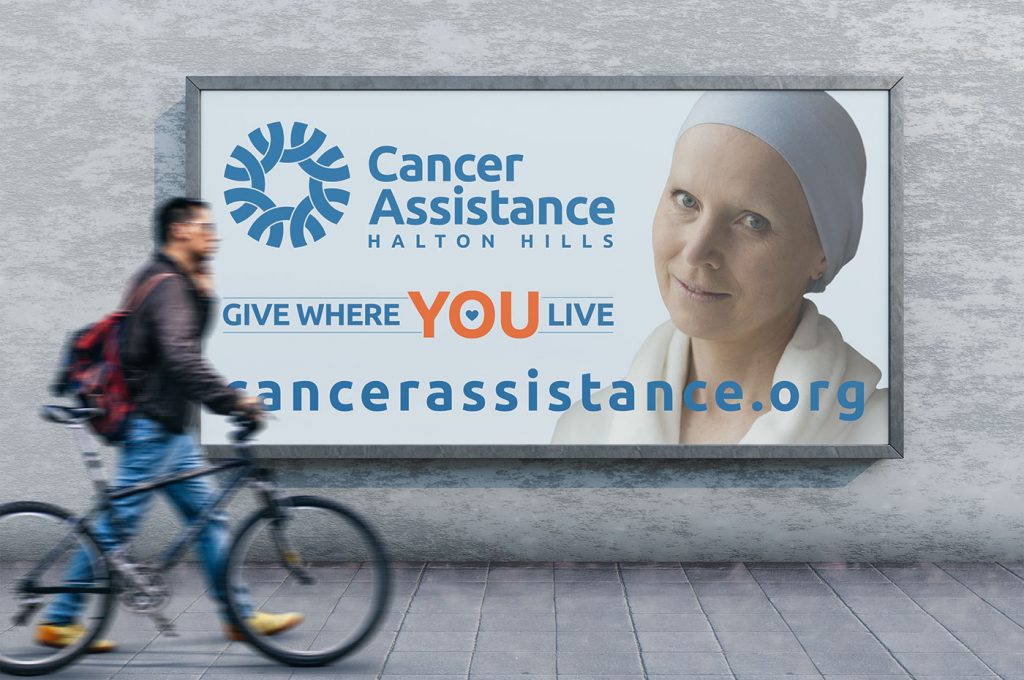
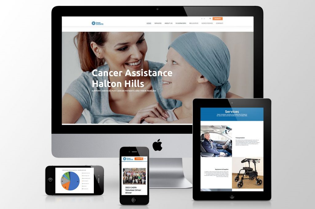
With the new logo, we also updated the website to match the new logo, colours, fonts and name.