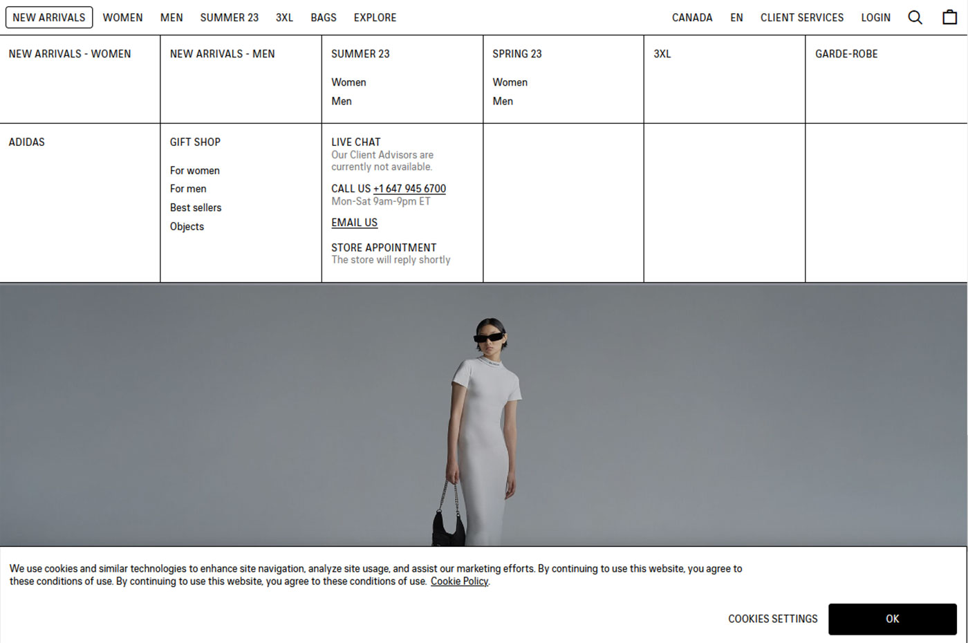
Have you ever looked at a website and thought, “That design is brutal!”
Brutalism in webdesign does not necessarily mean that the website is brutally ugly. Brutalism in design focuses on doing what you need with the bare minimum.
After WWII, the United Kingdom focused on re-building its war-destroyed cities and an architectural style that is referred to as Brutalist architecture emerged. Brutalist buildings are typical for their minimalist constructions showing bare building materials, concrete pillars and structural elements over decorative design. (Also typical of the communist era architecture in Eastern Europe).
Many brands prefer minimal design over functionality. For example, Balenciaga or Seth Godin’s website are so brutally minimal it pains me to look at them. In Seth Godin’s case, I always thought “The guy can sure afford a decent looking website, so why doesn’t he?” As for Balenciaga, frankly, it seems some fashion brands seem to make clothes that only really beautiful people can pull off. It doesn’t surprise me that their website is so brutally plain.
Websites are often stripped of fancy design elements to make them more accessible for people with disabilities. These websites are stripped of unnecessary images and use large fonts, bold, contrasting colours, and simple menus for easy navigation.
We believe that beauty is in simplicity and that every website should evoke positive emotions toward the brand. While keeping things simple (or simple enough) we can still create beautiful designs that are functional and pleasant to look at. But brutal design probably wouldn’t be our choice.

